Feed Smart
A brand built from the first sketch — end-to-end identity: strategy, logo, and visual system.
Feed Smart came to me with products and a mission, but no identity. I built the brand from a blank page — running the competitor research, shaping the strategy, developing three distinct concept directions, and designing the final logo and visual system. That identity became the face of the brand at launch, and it still anchors Feed Smart today: a product range now on shelves and a community that’s grown past 49,000 followers.

The Brief
Feed Smart is an Indian children’s nutrition brand built on a simple belief: how you feed a child matters as much as what you feed them. Their mission was to help parents raise healthy eaters with a positive relationship with food, right from the start — backed by science, rooted in Indian food culture.
What they needed was a brand identity that could do three difficult things at once:
- Flex across a wide product range — from flours to seed mixes to snack bars — without breaking.
- Stand out in a category where every brand was starting to look the same.
- Feel honest, trustworthy, and authentic — the qualities a parent needs before they’ll feed something to their child.
The Challenge
Before designing anything, I audited the category — both baby-food brands and the wider food-brand landscape — to find the gap.
The pattern was clear: there was no strong pattern. The category leaned on soft, rounded, friendly marks, but nobody owned a distinctive idea. That was the opening. The risk wasn’t standing out for its own sake — it was that “trustworthy” and “distinctive” usually pull in opposite directions. Trustworthy can drift into generic; distinctive can drift into gimmicky. The brief was to land both at once.
I also pinned down what actually made Feed Smart different: it was built around the first three years of a child’s life — the most critical window for forming eating habits — as one of the first Indian brands to own that space. That focus became the strategic spine of the identity.
The Approach
Rather than jump to a logo, I worked the problem in stages — and brought the client along with me at each one.
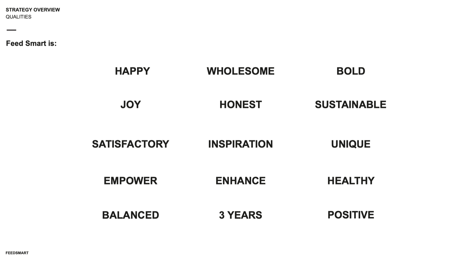
Strategy first. I distilled Feed Smart into a tight set of brand qualities — wholesome, honest, joyful, bold, healthy — and mapped them against what the brand uniquely owned. This gave the design a brief to answer, instead of a blank canvas to guess at.
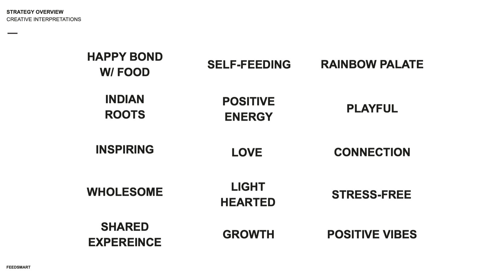
Three concept territories. From that strategy I developed three distinct creative directions, each a different answer to the same problem — so the client could choose a direction, not just a drawing:
- Lovin’ It — a child developing a “rainbow palate,” loving food and the people they share it with. Built on love, energy, and unity.
- Families In-Sync — parents and children sharing a happy mealtime together. Built on human connection and warmth.
- Playfully Messy — a space for kids to experiment with food and be joyfully, healthily messy. Built on play, colour, and balance.
Full development. Each territory was explored properly — logomark, wordmark, combination mark, and variations — so the options were real and resolved, not rough thumbnails.
The Identity
The chosen direction centred on connection — the warmth between parent and child at the table. The final mark reads as a heart and an embrace at once: soft, human, and instantly legible at any size, from a tiny pouch label to a hero on packaging.
I paired it with a friendly, rounded wordmark and a warm, wholesome palette — gentle pinks, soft blues, and greens — that feels safe and nourishing without tipping into clinical or babyish. The wider world extends into a storybook illustration style: children, animals, and landscapes that make the brand feel like something you’d want in your kitchen.

In Market
The real test of an identity is whether it survives contact with a full product line. Feed Smart’s did.
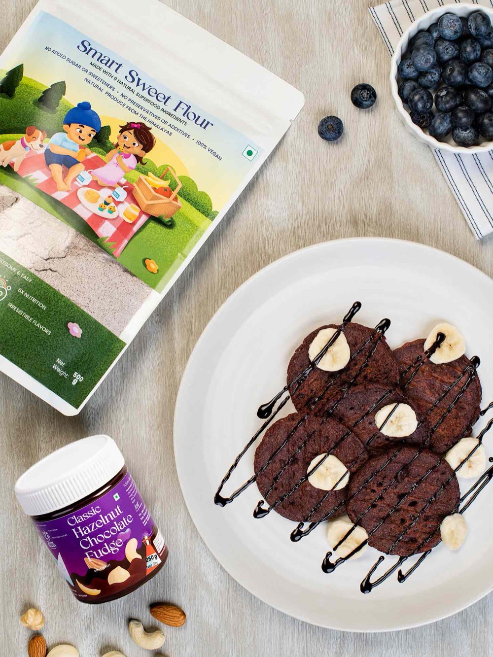
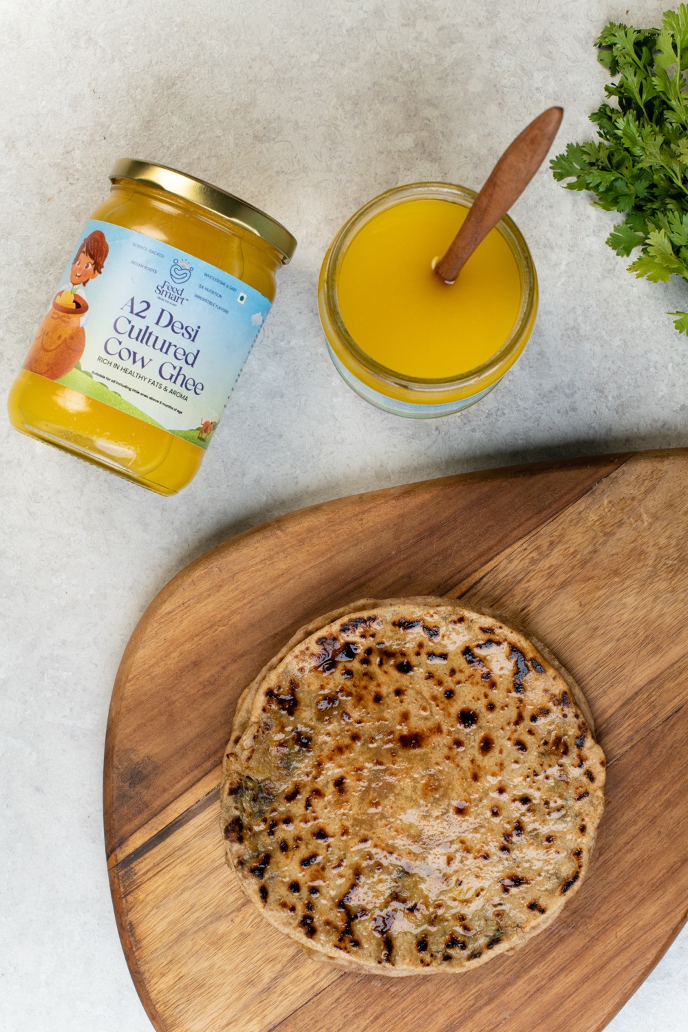
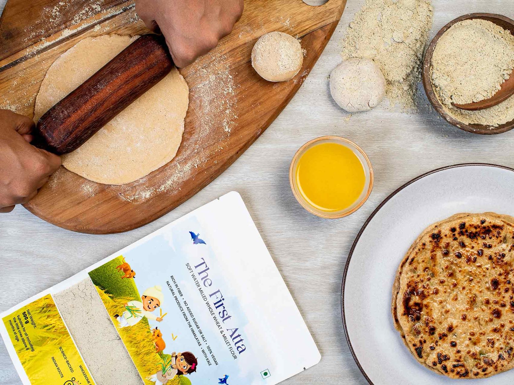
The system carries across an entire range — The First Atta, Power Packed Seeds, Smart Bars, and Smart Sweet Flour — each product distinct, but unmistakably part of one family. The logo, the illustration language, and the palette hold together across flours, seed mixes, and snack bars, on shelf and in lifestyle photography.
The Payoff
A strong foundation is one that’s built to grow into. Feed Smart launched on this identity, scaled a full product catalogue on it, and has since grown a community of 49,000+ — even broadening into new products and audiences while keeping the brand world I built at its core.
That’s the quiet measure of a good identity: years later, it’s still doing its job.
Feed Smart is my clearest demonstration of building a brand the right way — from research and strategy through to a final, flexible system that holds up in the real world.
I don’t start with a logo. I start with the problem: who the brand is for, what it uniquely owns, and what it needs to do. Then I give a client real directions to choose between, and resolve the chosen one into a system that works everywhere it needs to. The result isn’t just a mark that looks good in a presentation — it’s an identity a brand can actually launch, scale, and grow on.