Snoozley
Building a sleep brand from zero — a founder-led DTC venture: identity, art direction, and paid acquisition.
Snoozley is a sleep and wellness brand I built from the ground up — not a client brief. I owned every layer of it: the positioning, the brand world, the packaging, the 3D product art direction, the store, and the paid acquisition that turned it into a profitable business. The result: over Rs 1 million in revenue at a 3.3 ROAS — proof that the brand didn’t just look good, it sold.
The Opportunity
Sleep is a problem almost everyone has and very few products solve well. The category splits into two unappealing camps: clinical, sterile melatonin products that feel like medication, and sketchy, unbranded supplements with no trust behind them. Neither felt premium, and neither felt like something people actually wanted on their nightstand.
I saw room for a third option — a sleep brand that felt considered, a little magical, and genuinely premium, built for a market that was largely being ignored or talked down to. So I built it.
The challenge wasn’t fixing an existing brand. It was harder than that: launching a wellness product from nothing — no audience, no recognition, no trust — and making people in a skeptical market believe in it enough to buy.
The Positioning
I built Snoozley around a clear, ownable promise: deep, natural sleep without the trade-offs.
Every decision laddered up to differentiation against the category’s weak spots:
- Melatonin-free — no dependency, no next-day fog, positioned directly against the products people had already been let down by.
- No grogginess — you wake up refreshed, not hungover.
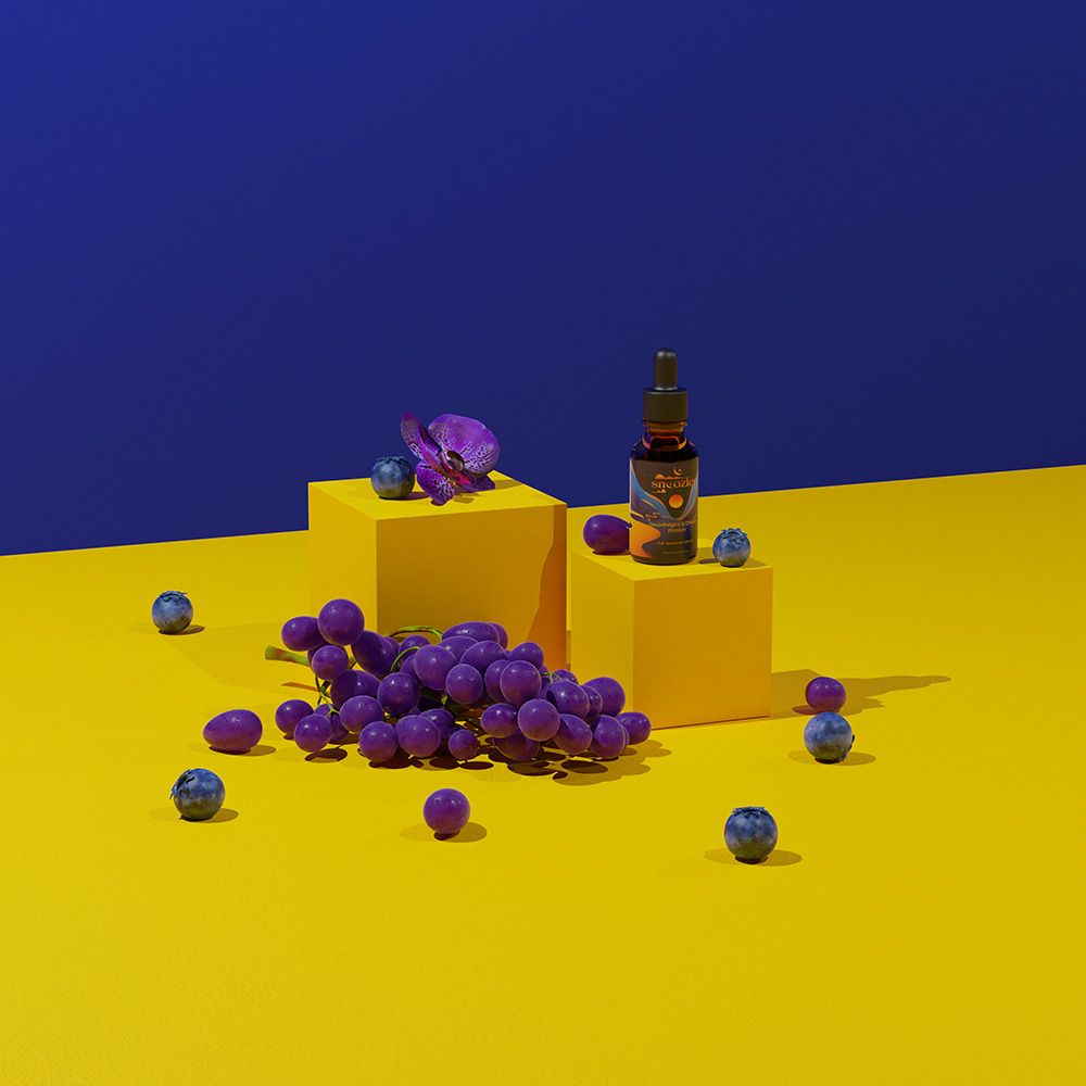
- Dessert-flavored, not “grassy” — a sweet berry-and-grape taste that made the experience something to look forward to.
- Premium and natural — organic ingredients and a quality story, framed against the “shady ingredients” of cheaper competitors.
Then I gave it a world to live in. Rather than another clinical supplement, Snoozley became a “potion” — GoodNight’s Dream Potion — wrapped in a dreamy, cosmic visual language of night skies, moons, and warm sunsets. The naming and tone turned a functional product into something with personality and desire built in.
The Brand World
The identity does the heavy lifting that the price point promises.
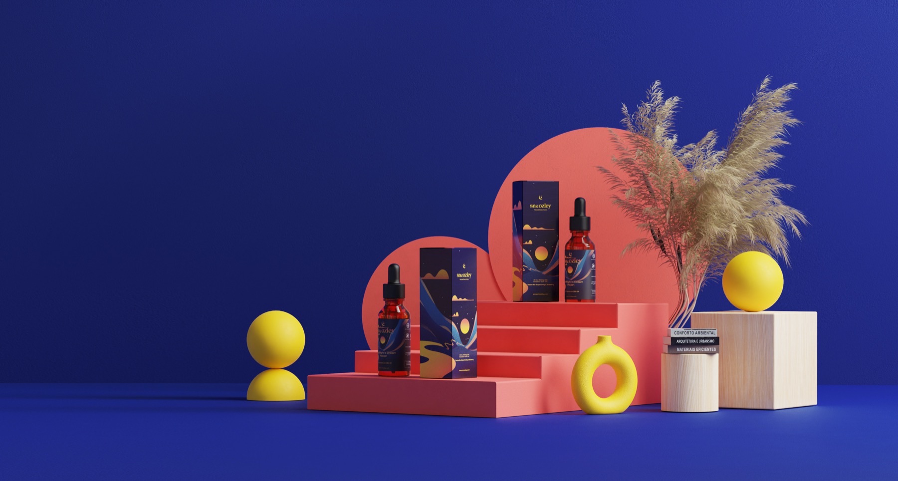
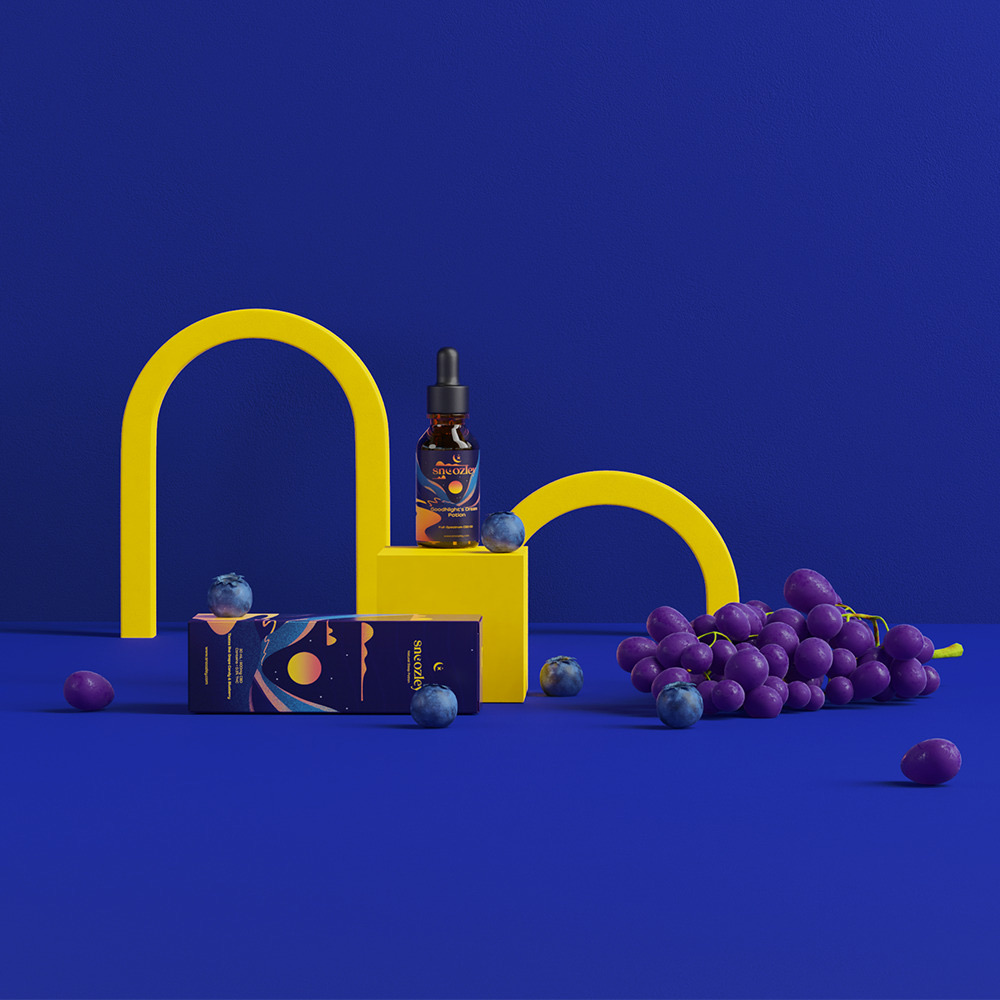
I built a palette around deep midnight blue, electric yellow, and warm coral — a combination that’s calming and dreamlike but still bold enough to stop a thumb mid-scroll. The packaging carries an illustrated nightscape — moon, mountains, a setting sun — that makes the bottle feel like an object you’d want on display, not hidden in a drawer.
The same world stretched across the full product line — GoodNight’s Dream Potion, the Anti-Insomnia Potion, and the Ashwagandha V. Juice — so the range felt like one coherent brand rather than three separate products.
Art Direction
I directed the full set of 3D product renders that became the visual backbone of the brand — across the store, the ads, and social.
These weren’t stock product shots. I set the direction for the staging, palette, and mood: the bold blue-and-yellow color blocking, the playful arches and podiums, the fruit and florals that reinforced the flavor story. The goal was imagery that felt like a premium beauty or lifestyle brand, not a supplement — and that consistency is what let Snoozley punch above its size.
The Creative That Converted
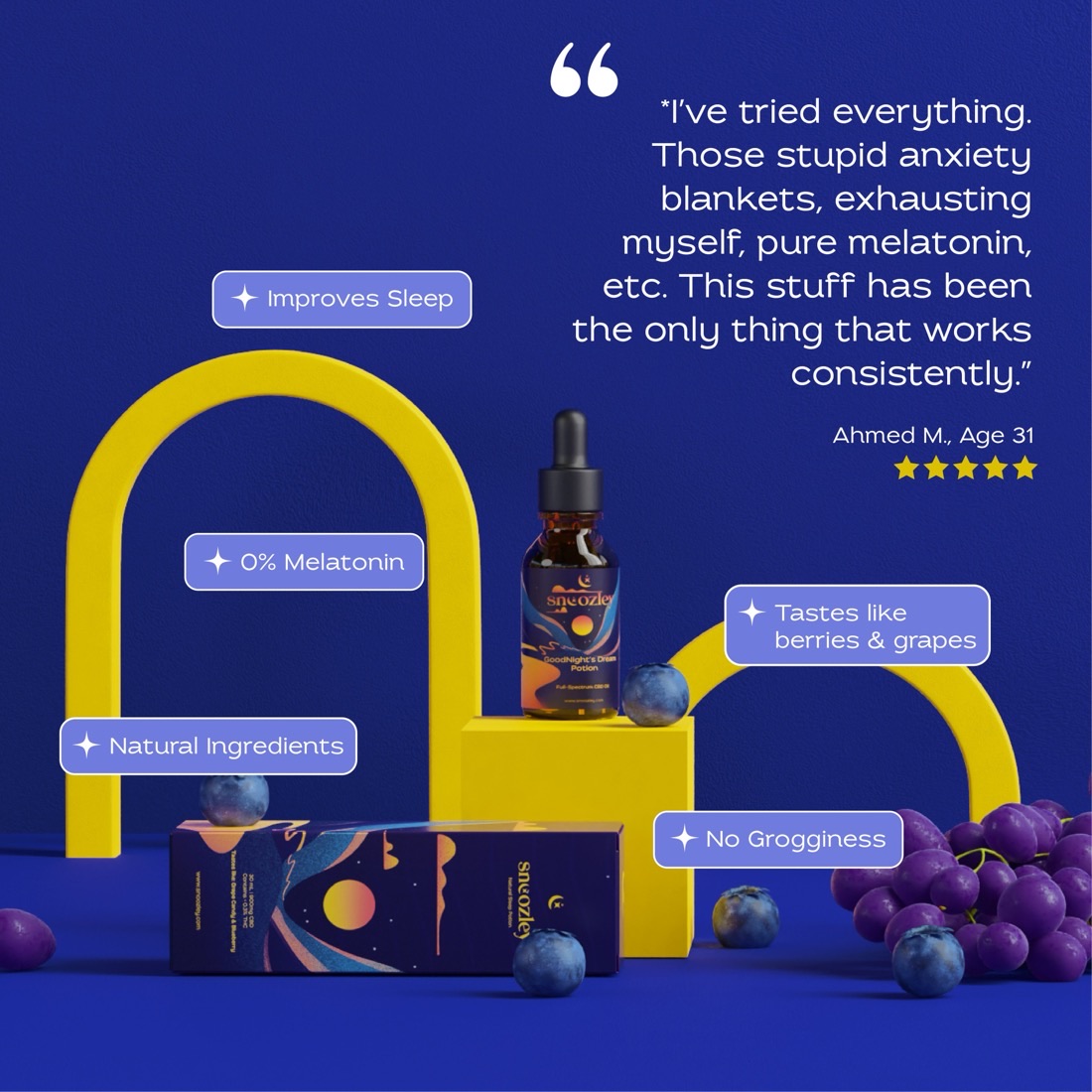
Strong brand imagery gets attention; the right message turns it into a sale. My best-performing creative paired the product render with a real customer testimonial — leading with the emotional truth (“I’ve tried everything… this is the only thing that works”) and surrounding it with the proof points that mattered: Improves Sleep · 0% Melatonin · Natural Ingredients · No Grogginess.
It worked because it did two jobs at once — it looked like the premium brand I’d built, and it answered the exact objections a skeptical first-time buyer has.
The Results
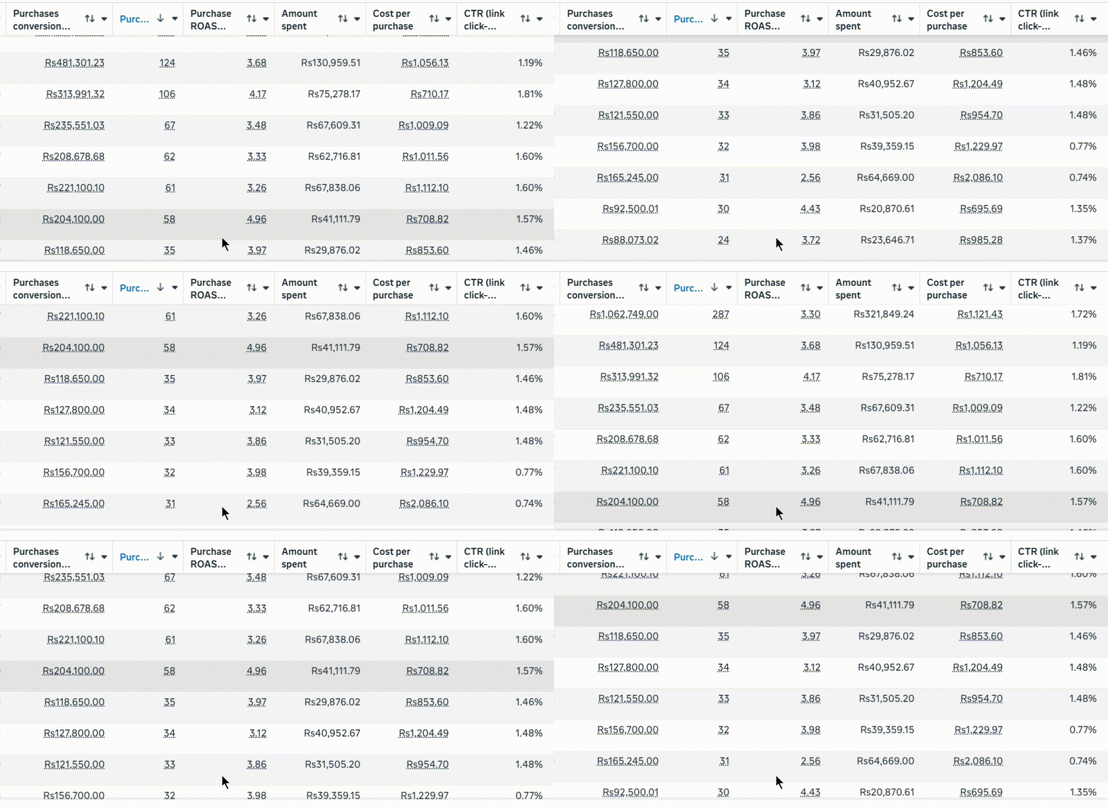
The brand wasn’t just an aesthetic exercise — it performed. The flagship campaign delivered 3.3× ROAS.
Every rupee spent returned more than three back in revenue — on a brand-new brand with no existing audience, in a market that’s hard to win trust in. And it wasn’t a one-off: across multiple creatives, every one came back profitable — with ROAS ranging from 3.3× to nearly 5×. That consistency is the real proof. The brand world, the offer, and the targeting were working together, not getting lucky once.
- Revenue generated
- Rs 1,062,749
- Return on ad spend (ROAS)
- 3.30×
- Purchases
- 287
- Ad spend
- Rs 321,849
- Click-through rate (CTR)
- 1.72%